Monday, November 29, 2010

Design in Society: Backpacks

Everyone wears them. They come in all different shapes, sizes, colors, and materials. Backpacks are one of the most utopian designs in society because they help humans everyday. A backpack is a simple bag with two straps attached to one side which allows for someone to wear the backpack on their back, that way it frees the user's body. Usually backpacks are the size of an average person's back. If it were too long, it would most likely bump into the back of your legs when walking, and if it is too small, then it wouldn't be practical to carry a lot of items.
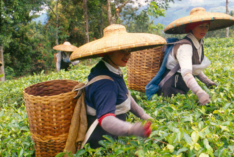


Backpacks are ideal because since the beginning of time, people are always carrying around things from various places or to other people. Often, hunters would need a carrying device when bringing game home. Bags were also made out of straws and people who farmed lands would use them on their backs so that harvesting the land would be easier. The different uses of a backpack date back a long time and helped the society for separate community roles.


In today's world, a backpack is used by everyone. Toddlers who can start walking can be seen with backpacks to hold their snacks and toys. Students in grade school through college use backpacks for textbooks, school papers, laptops, their lunches, or anything else they need for school. My mother brings a backpack to work because it fits her purse, lunch, and extra socks. Athletes often use backpacks for their lighter sports equipment. Even if someone doesn't fit any of these categories, they still can use a backpack to store and carry around items.


Backpacks are used worldwide and are one of the best tools for throughout one's life. We don't think about how much we use them and how many we have while growing up, but backpacks are an essential item.

Color Transforms.. at Hogwarts

In literature, colors are widely used as adjectives to describe things, but they also elicit emotions and represent different aspects of human life. Sometimes authors use colors to identify different characteristics within players of a novel or to foreshadow something that will happen. I17)n the Harry Potter book series, color plays a big role when differentiating the four houses at the Hogwarts School of Witchcraft and Wizardry. J. K. Rowling, author of this series, chooses certain colors to identify each house. Rowling demonstrates what Josef Albers describes as "what colors dominate in our work" and that "everyone has preference for certain colors and prejudices about others" (Interaction with Color, 17). Albers is saying that colors represent something and when used in a piece of work, they are important and convey meaning.


Two colors represent each house at the school: Gryffindor, scarlet and gold; Slytherin, green and silver; Ravenclaw, blue and bronze; and Hufflepuff, yellow and black. These colors correspond to different characteristics that each house values: courage, ambition, intelligence, and hard work. In an editorial done by Lindsey Skouras, the colors of Hogwarts are broken down and explained. The red or scarlet of Gryffindor represents both war and passion. It's energetic color correlates with how often the house is mentioned and talked about in the novel. Slytherin's green color is often portrayed as the negative connotation, the need for power, envy, and distrustful. The evil wizard, Voldemort, is often around the same colors as the Slytherin house and values similar aspects. The blue in Ravenclaw represent an obsessive, content, and concerned person, like Luna Lovegood. Luna is often living within her own mind, yet is content in the world and intelligent. Hufflepuff's yellow describes optimism and happiness, yet the house's other color is black. This is the pair where the colors are opposed, showing both friendship and fear within the house.

The colors of Harry Potter's world is easily memorable and the four houses represent negative and positive aspects of the characters in them.

Design is Dangerous: Amazon Kindle


The Kindle, by Amazon, is a portable, handheld, electronic device that allows users to digitally read different types of writings (books, magazines, newspapers, etc). It is also known as an "e-book" or an electronic book. Users can store digital copies of books onto a Kindle and bring the device anywhere and read.

The design of this product is simple; there are labels for each button and the product itself only serves one main purpose. There is one large screen for easy viewing and the size is about the same as an average novel.

However, the Kindle is dangerous to society in other ways. First, the Kindle directly impacts book sales at bookstores dramatically. Publishers Weekly claims that according to estimates from the U. S. Census Bureau, a “downward trend of bookstore sales continued in July with sales declining 2.3%, to $1.08 billion.” This is a hard hit for all authors, but also for people behind the scenes like employees with full-time jobs. Another aspect that disapproves the Kindle as a more convenient book option, is when using the Kindle as an alternative to textbooks or classroom tools. In a study done by I4U News, 80% of students rejected using a Kindle compared to using a textbook. Students said that it took longer to look up things and to flip through pages. Also, since there wasn't a tangible aspect to each page of the book, it was harder to write notes or highlight in the book.

Another study about using a Kindle inside the classroom, written by Amlink Computers, shows why the Kindle shouldn't be used as a learning guide for younger children. Digital technology promotes bad handwriting skills because kids are going to be used to typing electronically. Flipping physical pages of a book are also ways to improve hand-eye coordination and a Kindle doesn't offer the sense of touch that a book does. A child's eyesight could also diminish if they are constantly viewing a Kindle machine because text shown on a display screen is most likely impose health risks to their eyes.

The Kindle isn't an effective way to solve problems in the classroom or sometimes in your own home because its purpose and design don't promote a healthy way of living and treatment to our bodies.

Monday, November 15, 2010

media:scape


Media:scape is a product designed by Steelcase that promotes media sharing and group conversations. It's design is definitely ergonomic and user-friendly. This product is safe to use because of its simple design and the way it works. First you sit down around the table; Steelcase offers many different types of seating options like wrap-around couches or chairs. Second, everyone can take out their laptops and connect the cord that is inside the table top case. This case is flush with the table so it doesn't stick out on top. The cord connects to a laptop to share visual information from the screen of the computer to a TV like in the photo above. The average users of media:scape would probably be employees of a company, clients, or a group of people who are working and using the product to share digital media. These people would be very safe using media:scape because there are no surfaces or textures that are unfriendly or dangerous.

Comfort using media:scape depends on what type of surfaces are chosen for this product. It comes in different colors, materials, and fabric choices. At the Steelcase showroom in San Francisco, the seating was red wool, which isn't a popular choice among customers. Steelcase provides a vast variety of material selection when it comes to the table surfaces to the seating options.


This video made by Steelcase shows how easy it is to use media:scape. You open your laptop, connect the video cord, and when you want to show your laptop screen, you simple press the clear button on the cord connected to your computer. When new users try media:scape, they can also simply follow the visual directions on the inside flap of the case in the middle of the table. It shows the three steps and what order to follow them in. Another way that media:scape works is by offering an add-on piece behind the main sitting area that allows for people who are joining the meeting to not interrupt because they are invited in the conversation but aren't required to immediately take a seat, which can sometimes be distracting.

At Steelcase, the tour guide demonstrated with two computers how efficient the product was. She took out the two puck cords, connected them in the computers, and switched screens with a simple click of each button. This was an ingenious design and will definitely fit with the popularity and benefits of using shared media viewing in an office setting.

The look of media:scape comes in a large variety depending on the clients and what they want to choose for materials and surfaces. Because of this choice, clients feel like they are designing their own product for their own office spaces and enjoy the product more. Media:scape is a tool that will change how media sharing effects the conference room and will minimize frustrating technological errors, dealing with a single cord, and crowding over one small laptop screen. Steelcase designs products with the user in mind and solving daily problems in the office.

Steelcase

Steelcase redefines the traditional office cubicle. On Friday, I got a chance to walk through their showcase floor with a tour from one of UCD interiors alumni, Jennifer. She walked us through Steelcase's office products and the intelligence behind the design of them.

Jennifer described how the economy is now effecting how offices are built. Since there is less money to buy more space, the office cubicle is downsizing. She showed us a few designs that utilize space efficiently, yet still creating a workable area with privacy. Here is an example of a setting that uses standing height shelving which blocks these desks from the desks behind them. Steelcase also sells panels (the yellow ones in this photo) that work as non-permanent dividers. There is lots of storage space and optimal privacy when wanted.


Another product that I found very functional and appealing for an office space is the Airtouch table. This table adjusts and moves up or down to create a sitting desk or a standing table with just the clench of a small lever. The table uses pressure of air to rise up or down, therefore there are no electronics involved. Along with being able to use multi-functionally, this table also acts as a conversational bridge. If one person is working on a laptop and their colleague walks over, they can signal that they only have time for a quick and brief conversation by adjusting to a standing height. This shows the other person that they can walk up and talk for a few minutes. If you needed to show someone something you were working on, it's also good to raise the table that way the other person isn't bending over a desk. Steelcase also focused on bringing the idea of wellness for the human body at the workplace into their products. The Airtouch offers workers to change the way they are working by easily making a standing setting that suggests more movement and exercise.


Steelcase is researching and thinking about future products for the office that better serve the people in those spaces and how to make the work inviting and better for the body.

Monday, November 8, 2010

Objectified


"Remove everything unnecessary for maximum unity." -Erwan and Ronan Bourellec, Objectified

What the Bourellec brothers design are pieces that are very uniform and minimalistic. This couch they designed, for instance, doesn't contain any other aspect except the simple function of a large, cushioned tool for seating. Because this couch is stripped from all other decoration or additions, it is very simple and clean looking. People look at this couch and the only form of its details they can see are the black surfaces and white surfaces of the fronts and sides. The Bourellec brothers even simplified the color of this couch to easy hues and values. They created a unifying concept of a minimalistic couch which is that piece's sole purpose, using the form of color and shapes.


One of Brian Fies' points in his talk also resounds to what the Bourellec brothers quoted earlier. Fies says that his design process for this panel was to draw his mother wrathing around in her bedsheets. But he decided to revise it and thought "What if I made her nightgown black" that way the focus is just on her body. He thought even more and thought "What if I made the bedsheets black" and then this image came out. Fies stripped away all the extra elements of this image and focused it directly on the characters body. The form for this image was the simple black and white coloring and the drawing of the body parts of his mother. The content was showing only her body in pain and zooming in on that one simple idea.

In furniture or comic design, designers often over design and create. The revision of their production lets them answer what is the most important thing I want viewers to get out of what I made.. what do I want to say with this piece? This gives designers the exact purpose for their overall goal in their design.

Word & Image II

(photo courtesy of http://www.momscancer.com)

Cover the words of this comic and look at the images from left to right, top to bottom. What I noticed is the difference in facial expressions and the gradual hair loss from the same person. This is basically all that I see different in the six different panels with images. Now focusing on only the text and not the image, you get a sense of what they are talking about, quitting smoking or the cause of it. But you don't know if the same person is thinking these thoughts or saying them or even if it is the same person relaying out their thoughts. When separating words from images, there is a disconnection that goes on because if there isn't much description in the text, then readers have a hard time imagining what is going on. Someone could have read this comic without the images and thought the speaker was a 23 year old, athletic male just contemplating. Or vice versa, the images of an old lady with different emotions on her face could have been about a debate about who she should let cut her hair the next time at the salon.

The reason why images and words work so well in comics is because they narrate a story that only each component could be balanced with each other. Brian Fies who was the author of Mom's Cancer (where the comic was taken from), lectured about the collaboration between word and image and how the two creates the meaning of the whole. What he is illustrating in this comic is his mom who has a disease and her rationality for smoking and how she goes back and forth blaming others or taking responsibility for the condition she is in. This big idea would not have been seen if the words and images of this one comic were separated.

Word & Image


Tonight I watched one of most talked about films of the year, Inception. I remember the first time I saw the trailer for this film, the title image of the film helped me remember the film the most. Even though I saw the trailer for this film two or three months before it came out, I never forgot that I wanted to watch this movie because I remembered that the title was incorporated in mazes and cities.

Above shows two versions of the film title image. Both settings give a clue about what the film is about but is still specific enough that they represent that film uniquely. There is no other film that could use a maze to represent the film's story like the way that Inception does.

When comparing the two different title images for the movie, I think both of them show an equal amount of power and concept to represent the movie. The first one shows a maze formed around the title. Relating to the plot of the movie, it could literally be describing the hard, confusing, maze-like journey that the characters had to go through to reach the goal of inception. The second image shows the word "inception" shaped as skyscrapers coming out of the ground. The concept I thought about when referring to the movie is that the main character has a road block, the job if inception, that blocks a straight path to his family and what he wants.

These two ideas about the movie formed when thinking about how the word "inception" and the image that is formed around or into the text.

Monday, October 18, 2010

Call and Response


(photo courtesy of http://tinyurl.com/2ddg8x5)

Protests are demonstrated as a public act of disagreement with another group of people (company, religion, etc). Often they are located on street sides or at important events. Sometimes protests have a leader, who calls out to the bigger group of protestors and the others respond. It could be a chant of repeating words that express how they feel or the leader could ask series of questions and have the protestors respond.


(video courtesy of http://www.youtube.com/watch?v=CQj_5VGCPVg)

The protestors carry signs and usually make loud references to what they are doing at that protest. It is an example of call and response because protestors want the audience, which are bystanders, the public, or policymakers, to listen to their side of the problem and they do it by protesting.

(photo courtesy of http://tinyurl.com/2bcx46m)

To link this topic to design in society, if you think about the protest as being the design, you can see the idea, organization, production, and result that happens. People begin to strongly feel for a topic and communication then occurs to do something about making their stance important and known. They create a time, place, and send out this information to others to try to get as many people to join. The protestors will often make signs that can be easily read from a car or across the street. Then at the actual rally, their purpose is for people who don’t know or disagree about the subject to understand how they feel.

Designers do this with their art; they come up with an idea, they organize it, orchestrate it, make it, and show it, to get a response from their audience.

Wayne Thiebaud

(photo courtesy of http://www.nga.gov/education/classroom/counting_on_art/img/img_thiebaud_frostedfractions_lg.jpg)

For painting pies and cakes, Wayne Thiebaud created a new era for pop art in the 1960s. I have seen some of his works before; at a friend’s house or at a local café. But I never really appreciated his work until I saw it up close and in person at the new Crocker Art Museum in Sacramento. I read that ­Thiebaud was raised in California and even dabbed a bit of his teaching career here at UC Davis. This made me more inclined to pay attention to his work and interact with it as an audience.

A lot of people would probably question his subject matter. Cakes? Pies? Lipstick? The objects of his paintings show the food culture of that time in a simplistic manner. The easy shapes of triangles and circles point viewers to the painting as a whole, the gestalt, of composition. For me, when I see that Thiebaud doesn’t fill up his pictures with painted stuff, the background becomes it’s own shape and lets me imagine my own scene of desserts.

When I stepped closer to look at the paintings, I noticed that with almost every piece that had a single color in the background with objects in the foreground, Thiebaud used his brush and outlined the figured with the background color. This technique struck me because I’m used to seeing paintings where the background was created first, then the foreground, that way the foreground overlaps the background. However, Thiebaud exaggerates this change by making the background strokes very straight and horizontal, then outlining cakes or human figures with the same paint.

Analyzing Thiebaud’s art at Crocker, I realized that artists make many intentional marks in their pieces that might not be known at first sight. Whether it’s simplifying the composition or minute details of brush strokes, it all is for a purpose and it is all a design that the artist chooses.


Monday, October 11, 2010

D3$1GN 1N $0C137Y

To me, design in society translates to a tangible, physical, and purposely orchestrated thing that all people are frequently connected to in this day and age, even at this specific second. I thought about things that the average person in America would have.. homes, cars, clothes.. but everything seemed too vague and not a simple design that interests me. I narrowed my thoughts to something that my peers and I use very often, a laptop.

Roughly 200 years ago, a man designed a layout for the alphabet that has now stayed on billions of computers worldwide. The QWERTY keyboard was first designed for the typewriter. When Christopher Sholes invented the first modern typewriter, he originally configured the keys in alphabetical order. But as he used the typewriter, the "mechanical bars which struck the paper consistently jammed." (http://www.nndb.com/people/360/000162871/) Because of this jam, Sholes dived in and rearranged the letters so that the ones that jammed the most frequent were furthest apart from each other. This is when the layout of the keyboard that we use today was deemed the layout for mechanical typewriters.


Everyone who designs something has a purpose, whether it’s to help with convenience, looks, or to fix a keyboard jam, it’s important to know why and how the original designer intended things to be. Often we overlook the simple objects that we use every day, and if we just “googled” why things look or work the way they do, everyone would have a little more knowledge about the design and designer behind it.


Creativity from Without


Creativity from without is a theme that describes the inspiration of a design that stems from the outside environment. This includes materials, nature, or society as a whole. An artist who demonstrates using creativity from without is Joe Pogan. Pogan takes metal spoons, dog tags, tools, combination locks, screws, anything made from metal and welds extraordinary pieces. His expertise is in making birds but he also makes special order animals like fish.

The things that Pogan makes are very well done with pristine details and reflect the true animal he is depicting. His birds look like they have just landed from a short flight and will take off again any second. The life-like feathers and eyes give Pogan's art attention because he can realistically show an animal and it's natural form. Not only does Pogan compose his sculptures to make them look believable and real, he also has the skill of an experienced welder to make his sculptures. Ndigallery describes that Pogan's "welding ability combined with an innate artistic talent gave him the skill to create his highly original animal sculptures using a variety of 'found' objects."

What Pogan creates and what he creates with is a paradox that speaks loudly to what I think his message is. The materials he uses are man-made items that are easily found and often discarded. We as humans make so much waste with the lifestyle we live and we are blinded by our daily tasks to see the things we throw away. It takes someone like Pogan to step back from everyday motions and see the products that humans make and abandon too frequently. Sure, not all of us have the talent of metal welding, but we could learn from what Pogan creates to think about our natural world butting heads with the world of small and insignificant products. If there was any way to bring the two together, Pogan has done it.


Stone Soup

Rubber gloves + shoebox + paper clips + tissue paper + dictionary = an artful, interesting, and cohesive design?

Put eight design students together and give them one hour to make something with a mosh-pit of materials and objects. This assignment gave our group a chance to get to know one another and to collaborate a piece by using a different assortment of materials.


Our group thought about what topic or main idea to focus our piece on and we thought it would be fitting to relate it to Davis. Inspiration was found on one of our group member's t-shirt, and we all eventually agreed on creating an octopus to represent Davis' KDVS radio station.


We started putting some materials together and let the materials fit together in different placements. At first, we started with an almost exact plan for what we wanted to do. However, we realized that we should think less about the actual figure we were trying to portray, and just place things here and there, where each of us thought it would look good. This let us all have a part in what went on with the project and it helped let our art piece speak out more as a depiction of what we used to make it. The project became less about using the materials to make the form of something, but letting the supplies or “ingredients” speak for themselves.


The story Stone Soup, by Maria Brown, reflected a sense of coming together with different parts and making something that is totally unique.


(all photos courtesy of Perry Sanesanong)

Monday, October 4, 2010

My Antonius laundry bag was $12.99

I visited the West Sacramento Ikea this weekend. While exploring the different furniture sections and walking through the showrooms, I asked myself: Why do so many people come to shop at this store? Aside from the products itself, is there something about the design of this store that gives such a positive response from its customers?

I pondered about these questions and found that even though I couldn’t answer them for others, I could ask myself: Why do I want to go to Ikea to shop for things for my apartment?

Along with easy to follow instructions and $4 Swedish meatballs, Ikea hits affordability on the mark. The store definitely provides a range of products that are priced fairly low and inexpensive, even for the college students. This allows a great variance of people, especially me, to shop here. Because of this, I feel like more people have opened up to shopping for their homes and start to enjoy it, as if it were a simple Sunday family activity. For me, going to Ikea opened up the world of interior decorating as an interest of study in college.

Since so many people like the same products from the same store, it would make sense that a large amount of those people would purchase those products to furnish or decorate their homes. But no, I don’t want to have the same couch, table, desk, and bed as everyone else. I like showing my individuality through what I put in my room and I wouldn’t be pleased if I saw similar stuff in someone else’s room. That wouldn’t make me or my tastes of style unique. The store doesn’t promote the same furniture for everyone, but it provides the sense of individuality by building a base (i.e. a black coffee table) and then adorning it with your own touches (i.e. coasters, flowers, magazines). This is what makes your style and Ikea provides a step stool for making your space yours.

The concept I’ve tried to touch upon is the fact that this store was made by our own human minds and creativity. When you walk into Ikea, you want the same feeling every time you walk into your own home. Not everyone has the same tastes or likes the same decorations or style, but Ikea is an affordable way to provide a sense of self-creation in one’s space.

Artchitecture

What do we ask design to do? Actually, what do we ask designers to do?

Inspire us. Make us comfortable. Shelter our bodies. Hold our precious items. Secure our loved ones. Some of these things we take for granted.

One of those taken for granted, for example, is architecture. When discussing the architecture of ancient civilizations in history classes, we appreciate the strength and intelligence that it took to build the great pyramids of Egypt and the vast Buddha monuments in Asia. We see that as a style of buildings, rather than a place of worship or marketplace or living areas. We now value the effort it took for those people to build those structures, but how many decades did it take to see those places as design? Why don’t we view the structures we now live in, the cities we drive through, the schools we attend, as being pleasant and artful architecture?

Someone, a designer, had to have come up with an idea to put a big structure with walls, doors, windows, and a roof in a certain place. That sounds easy enough, but as people progressed into the society we have now, everything became more complicated. Designer architects answer many more questions for their projects like wheelchair ramps, wall and floor samples, lighting fixtures, environmentally friendly materials, fixtures, floor plans, etc. As we keep advancing, the options for building pieces become more and more endless. Does this still mean that what architects do is still considered design?

Yes, in fact, I believe that one of the basic answers that stems from the question “What is design?” is that it is an idea that someone has, who then creates its and produces something that is able to be seen visually.

Saturday, October 2, 2010

Bic 0.7mm

“Wow, this is such a cool pencil.”

My childhood wouldn’t have been complete without this simple black and white Bic 0.7 mechanical lead pencil (with the clear encasing on the outside, of course):

I remember first obtaining my own mechanical pencil when I was about 7 or 8. And at school I would be jealous of other kids who had pencils with the side clicker like these:

Or the ones where lead came out by shaking the pencil like these:


This writing utensil changed the way I did any type of writing or drawing at home and school. I no longer had lines that were constantly varying in width because this pencil let out the exact same line every time. While I would study Chinese, writing complicated characters would be a lot easier since the pencil was always sharp and precise.

Sharpeners and pencil shavings were a thing of the past. With this awesome device, all I needed to do was put two pieces of lead inside and my pencil was loaded for the whole week. How convenient was that! Because of its easiness by clicking the top and having the perfect amount of lead come out, I was able to focus more on my homework, writing, drawing, etc, instead of worrying about continuously getting up to sharpen my pencil.

The endless amount of color ways and designs that mechanical pencils came in allowed me to match the mood I was in or to make a spelling test more fun to take. I believe that this is important for a young student because children are attracted to fun, colorful, individual tools for school and a mechanical pencil fulfills that learning experience.